We talk quite a lot about population, prices, wages and all the time in the podcast; so I thought it might be good to have a bit of a reference post.
English population, 850-1600

European Population estimates

Prices and inflation

We talk about the impact of price inflation all the way through the 13th century. But as this prices show, it’s not that easy. Yes there is a rising trend, particularly for wheat, but it wouldn’t have been easy to predict decade to decade, let alone year to year.
Labourer’s Wages
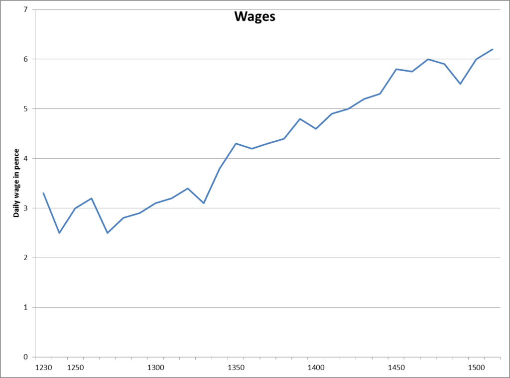
This chart shows the growth in a skilled labourer’s wages over the period; there’s almost two halves to the chart. up to 1350, there’s some growth, probably driven by general price inflation, but held back by lots of supply. After 1350, there are a lot fewer skilled labourers around, and those that there are can charge a lot more.
Relative size of towns – evidence from taxation
The chart below gives a perspective on the relative volume of trade through each town. Although by this stage London would have been by far the largest town by population, it’s clear from this that other towns were much closer in terms of the colume of their trade. Obviously there are a lot of missing west coast ports and inland towns, but the total volume of trade in these ports suggested by these returns was £75,000. It’s also quite fun, of course to see how times have changed over the centuries – towns like Boston and Fowey had an importance in trade that these days it would be difficult to see.
